

'A Healthy Appetite' Has its Cover
Reactions and reflections on seeing the book I've dreamed of for a decade take shape.

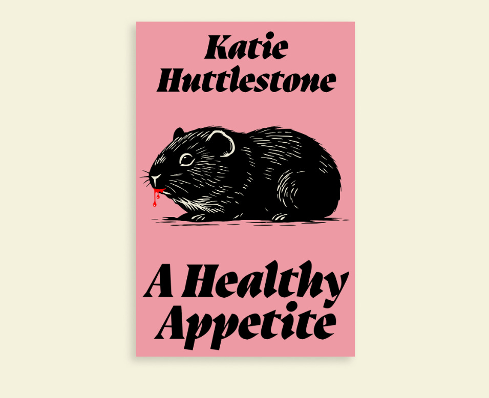
My debut has a face! And what a bloody pretty one it is too. But how did it take shape and how much of an influence did I really have?
I’d wondered for two years what my novel’s cover might eventually look like. I used to screenshot cover reveals for other authors whose books I felt offered the kind of aesthetic that would suit A Healthy Appetite. I even made a prototype cover for my beta readers which featured a plate with a bunch of pills on, the letter ‘P’ emblazoned on them to represent the name of the drug in the book. It sounds naff but it was quite good, if I say so myself.
At the time, it helped early readers to kid themselves into thinking the book was a ‘proper thing’ before I had an agent. Sometimes, reading an early version of a writer’s work can feel like a chore - the book hasn’t been professionally edited; it isn’t necessarily ready to be read yet. Giving my manuscript in its unfinished, unedited form a cover felt a bit like manifesting something better in the future.
Flash forward to my book deal and I knew it would earn the cover it deserved, the one that would come to define it for readers. My editor was amazing at ensuring I was involved in the process, hiring a designer I’ve admired for a long time (the always impressive Luke Bird) and letting me have my say in a detailed questionnaire. When I sent her the link to the mood board I’d designed with influential covers and elements I liked the idea of including, she didn’t tell me to leave it to the professionals. In fact, I can see in the finished product that it helped shaped the cover’s direction, that my vision became the artist’s vision - a community effort with Luke bringing it to life.
When I received the email with the initial designs inside, there were two to pick from. I loved them both but felt quite strongly about the option we didn’t go for in the end. In it, a woman with a smear of tomato puree on her face. It was bold and shocking - the paste easily mistaken for raw meat. The problem was, that for some it was too off-putting. After some back and forth, I agreed it wasn’t the right direction. The other option though, still didn’t feel right in terms of the colour scheme chosen. I told my editor this and she agreed to ask Luke to come up with a few more variations. When he did, and I saw the pink, I knew we’d found our cover.
In typical Dead Ink fashion, it’s a cover that compels without doing too much. There’s a hell of a lot of subtlety to the detail. The little pop of red coming from the guinea pig’s mouth; the guinea pig itself as the perfect metaphor for the drug trail and Hannah’s position as a phase one patient.
The typeface too is perfection for the gothic/horror elements of the story. Luke chose it for its striking and contemporary feel, with its subliminal nod to gothic blackletter, which was used so much in vampiric literature and visual culture. You’ll have to read the novel if you want to see why that matters. See? So much detail.
I hope readers love it. It’s for you really, not for me. Although I have to say, it will be a long time before I can stop staring at it…
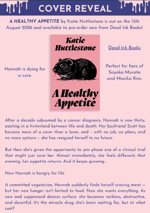
In other news, you can now pre order ‘A Healthy Appetite’. I hope that you do - it would look so pretty on your shelf <3
A Healthy Appetite - Dead Ink Books ← PRE ORDER BUTTON.
A Healthy Appetite by Katie Huttlestone | Waterstones ← WATERSTONES
A Healthy Appetite: Amazon.co.uk: Huttlestone, Katie: 9781917792264: Books ← AMAZON
Screen Saver 🎬
What I’m Watching
*Disclaimer - It has recently come to my attention that the author who wrote the novel the following movie is adapted from, has spoken against the boycotting of Israeli publishers in the wake of the genocide in Gaza. If you would like to know more, please follow the link to an interview with her on this topic:
Die My Love (Dr Lynne Ramsay, 2025)
“I’m stuck between wanting to do something and not wanting to do anything at all.”
Die My Love pushes its actors and its audience to it’s limits - it’s a challenge really. How much can you stand? How much can any of us stand? If the thing you love is in pain and suffering, you put it down. But humans don’t receive the mercy kill animals do. So what happens if you’re forced to weather the storm when all you want to do is set the world on fire?
: Find it on Netflix, Prime Video, Hulu & more")
Die My Love, much like Ramsay’s We Need To Talk About Kevin, had movie-goers walking out of theatres after thirty minutes. Yes, it makes you squirm. Yes, Jennifer Lawrence is at times, unforgiveable. But if you give up you let misogyny win.
In this movie, about a crumbling marriage and the agony and over stimulation of new motherhood, everything, from the music, to the incessant barking of a dog, is meant to replicate those feelings of overwhelm.
Grace’s husband (played by the wondrous Pattinson) is hardly there, and when he is, he’s making things worse. It’s not that Jackson doesn’t try to support his wife. There are moments of genuine tenderness and consideration that demonstrate a love that is hard to deny. It’s more than he doesn’t see her or the scale of her grief. A house renovation and a new car simply won’t fix what’s broken.

Of course, a movie about a relationship on the cusp of disaster is nothing new, but Ramsay’s take is so devastatingly astute, so achingly real, I couldn’t take my eyes off the flames as they burned the whole thing down.
Towards the beginning of the movie, Grace refuses to look through a telescope, claiming that she doesn’t like the stars because they make her feel small. But the lives depicted here are anything but small. Jennifer Lawrence is one of the most versatile actresses of her time. Once you get past the staggering amount of seductive crawling, her portraying of intrusive thoughts winning is staggeringly accurate.
Postpartum psychosis is no joke, and its at the heart of the movie, but it rubs up against Jackson’s mother’s grief too - the loss of her husband forcing its own kind of suspension of reality. In a telling parallel between early motherhood and widowhood, Pam (Sissy Spacek) of Carrie fame, is phenomenal as a woman grieving the loss of her husband. If Lawrence plays a caged dog clawing her way to freedom, than Pam is a sad little bird remembering she still has wings.
4.5 ☆☆☆☆
Current Reads 📚
Room 706 by fellow 2026 debut Ellie Levenson
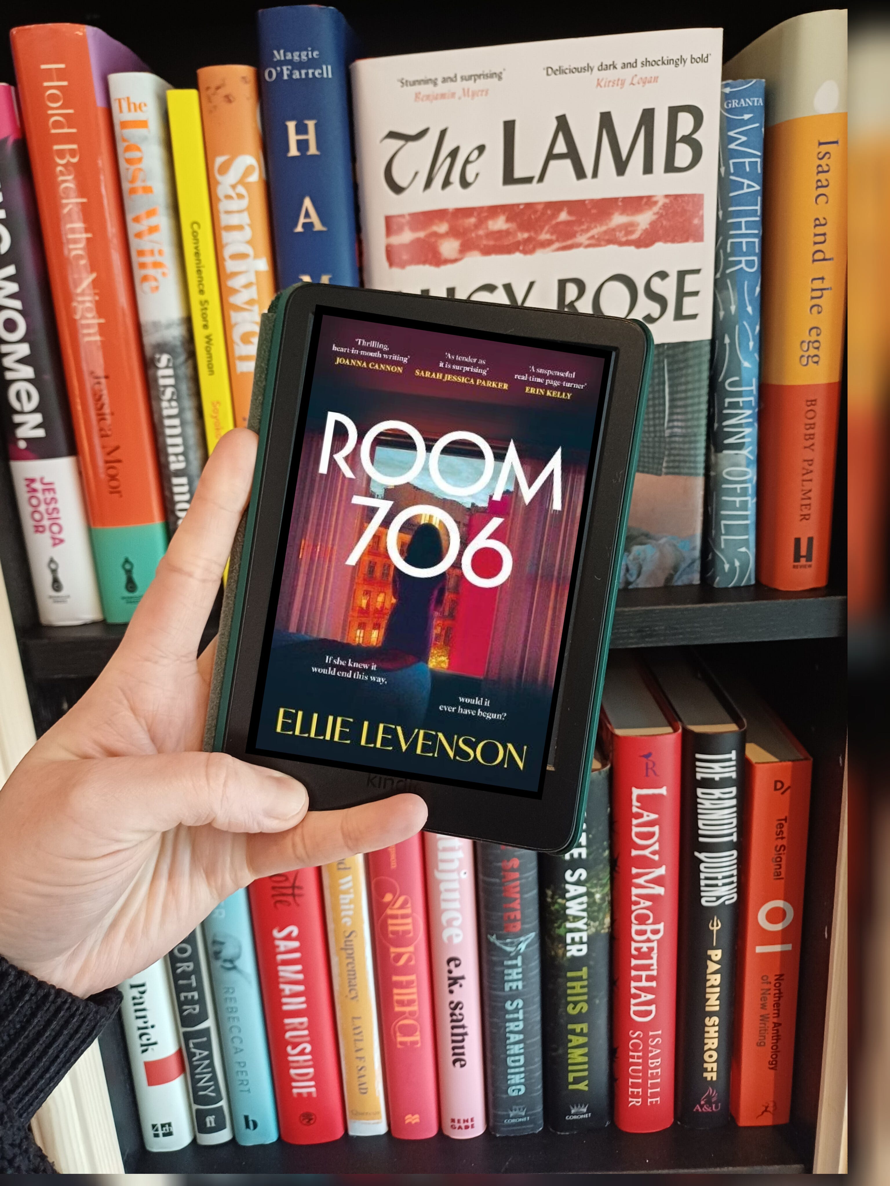
Kate turns on the television in room 706 to find that the very hotel she is conducting her extra-marital affair out of has been occupied by terrorists and is under siege.
What a killer elevator pitch! I can imagine that when Ellie sent of her query letters to agents, and then the book to publishers, that it gripped them by the throats, as the story does when you read it.
It’s packaged like a thriller, but is distinctly literary, both in the quality of the prose and the careful handling of themes, like how our choices transform not only our lives, but those closest to us. The butterfly effect, if you will.
The novel delays revealing the outcome of the present tense narrative to delve into Kate’s past - how she fell in love with the very husband she’s cheating on; then later, how she came to have an affair.
At it’s heart, this is a novel about the unrelenting demands of motherhood - of the assaults on time and self. When you get past the adultery, Kate’s story is very human. I love characters who are flawed but the writers work hard to help you understand the genesis of the bad decisions they make. Room 706 does this and more with an ending that will divide readers. But really, don’t all the best endings do this?
This is so exciting 😍😍😁
Wonderful to hear how involved you were in the cover design - a real meeting of minds!!